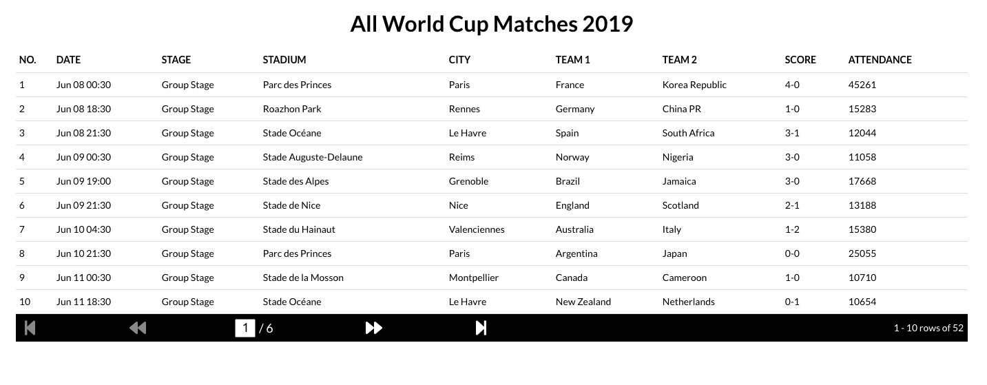
This is part 2 of the custom React Grid series. In the first part, we read the table data from the api and then loaded it on to the grid. In this one, we will add dynamic pagination.
In the previous section, we loaded data to our table from the api and displayed it. Now, we need to add dynamic pagination as we do not want to show all the data in one page. The code for this part is available here. So, let's get to it!
Firstly we will define max rows per page as 10 and introduce a pageNumber state in our main component. Then we will calculate the total pages and the 10 games that should be shown based on the page number as below.
// GridMain.js snippet

const ROWS_PER_PAGE = 10;
...
const totalPages = parseFloat(
  (filteredMatches.length / ROWS_PER_PAGE).toString().split(".")[0]
);
  const matchesToShow = filteredMatches.slice(
    (pageNumber - 1) * ROWS_PER_PAGE,
    pageNumber * ROWS_PER_PAGE
  );
Now, if the last page has less than 10 rows then our table will reduce in height moving all the other componnets below it (if there are other components). To prevent this, we will fill the table with empty rows to keep the table height intact.
// Grid.js snippet
  let emptyRows = [];
if (rowsPerPage > matches.length) {
  for (let i = 0; i < rowsPerPage - matches.length; i++) {
    emptyRows.push(i);
  }
}
...
{rowsPerPage > matches.length &&
  emptyRows.map(emptyRow => (
    <div key={emptyRow} className="grid-row-empty"></div>
  ))}
All that is left now is to define a reusable pagination component which we can place below our Grid component. This will have 4 buttons for step to first page, step to previous page, step to next page and step to last page. We will also provide an option to provide the page number manually, and display the current rows status (e.g., 2-20 rows of 52). The said component will be independent of the Grid, it's values, column count, maximum row count, api, etc. To enable that it'll need the below props.
- rowsPerPage: Maximum allowed number of rows. This will help in showing the display status.
- rowsInCurrentPage: Total available rows rto be shown.
- totalRows: Total rows returned by the API. If you have a grid which will need to make separate api calls for every page, then this will be the total rows in the system.
- totalPages: Total pages of data.
- pageNumber: Current Page Number.
- setPageNumber: A setter for Page Number whenever it is modified.
In the Pagination Component, let's define a reusable component for the pagination buttons. This will take an icon, a method to fire on click and a boolean flag to say whether the button is disabled, as props. We wil use FontAwesome icons.
// Pagination.js Snippet

const PaginationControl = ({ icon, onClick, isDisabled }) => {
  return (
    <div
      className={
        isDisabled
          ? "pagination-page-control-disabled"
          : "pagination-page-control"
      }
      onClick={() => {
        if (!isDisabled) onClick();
      }}
    >
      <FontAwesomeIcon icon={icon} />
    </div>
  );
};
As discussed, the Pagination Component will have 4 buttons for navigation, a textbox to go directly to a page and a display stating the current rows on display. It will look something like below.

Before we look at the presentational JSX, we will write a method to update the page number as and when the buttons are pressed or the textbox is given a value. The page number will get passed as a parameter. Note that we will maintain a local state for page number as well. This is mainly to hold the page number value from text box before the user hits the return key. In addition, we will set up a useEffect hook to update the page number from local state as and when the page number prop itself is updated from the parent.
// Pagination.js Snippet

const [currentPageNumber, setNewCurrentPageNumber] = useState(pageNumber);
useEffect(() => setNewCurrentPageNumber(pageNumber), [pageNumber]);
  const updatePageNumber = currentPageNumberValue => {
    if (
      isNaN(currentPageNumberValue) ||
      Number(currentPageNumberValue) > totalPages ||
      Number(currentPageNumberValue) < 1
    ) {
      setNewCurrentPageNumber(pageNumber);
    } else {
      setNewCurrentPageNumber(Number(currentPageNumberValue));
      setPageNumber(Number(currentPageNumberValue));
    }
  };
...
With all this set, we can now write our JSX as below. For the textbox, we will have an onchange handler as well as an onblur handler. If the return key is pressed, we will fire the blur event and hence updating the page number as well. You may change this logic as per your needs. Also note that if a number lower than 1 or a number more than the number of pages is entered, we simply ignore it.
// Pagination.js Snippet

return (

<div className="pagination-main">
<div className="pagination-control">
<PaginationControl
icon={faStepBackward}
onClick={() => updatePageNumber(1)}
isDisabled={pageNumber === 1}
/>
<PaginationControl
icon={faBackward}
onClick={() => updatePageNumber(pageNumber - 1)}
isDisabled={pageNumber === 1}
/>
<div className="pagination-page-input-control">
<div className="pagination-page-control">
<input
type="text"
className="pagination-page-input"
onChange={event => setNewCurrentPageNumber(event.target.value)}
onBlur={() => updatePageNumber(currentPageNumber)}
onKeyDown={event => {
if (event.keyCode === 13) { //on return key press
event.target.blur();
}
}}
value={currentPageNumber}
/>
</div>
<div className="pagination-page-control pagination-page-input">
{" "}
/ {totalPages}
</div>
</div>
<PaginationControl
icon={faForward}
onClick={() => updatePageNumber(pageNumber + 1)}
isDisabled={pageNumber === totalPages}
/>
<PaginationControl
icon={faStepForward}
onClick={() => updatePageNumber(totalPages)}
isDisabled={pageNumber === totalPages}
/>
</div>
<div className="pagination-info">
{" "}
{(pageNumber - 1) _ rowsPerPage + 1} -{" "}
{(pageNumber - 1) _ rowsPerPage + rowsInCurrentPage} rows of {totalRows}
</div>
</div>
);
With this, we should get a screen like below with pagination working. If you have an api that fetches data for every page, then you should include that as well in your setPageNumber prop passed from the main Grid component.
